

Ambiguity (or sloppiness?) at the Bemis
Artists, these days, have become our culture’s prophets. They are frequently found using their art to speak condemnation or judgement on the culture they are part of, just as was done by the prophets in the Old Testament; at times, just like the prophets, they are seen giving vent to a sense of enraged justice, or even simply quietly lamenting. Oftentimes the artworks they create are startlingly similar to the “performance art” of the biblical prophets. What follows is not at all a condemnation of this didactic / ideological / propagandistic art. It is, rather, a call to a greater conceptual rigor on the part of the artists, or, perhaps, it is an encouragement for the artists to hone the tools of their craft to a more objectively accurate point. Or perhaps it is simply a record of one critics’ disappointment with one particular gallery show.
Omaha’s Bemis Center for the Contemporary Arts is at the absolute bleeding edge of what’s happening in the art scene today. It has a generous residency program, attracting artists from all over the world. Its series of sound art performances showcase strikingly innovative, challenging works which blur the limits of what counts as music. The Bemis makes a commendable effort to be involved in the community, regularly hosting potlucks and open studio events where people can meet the artists; and a vibrant lecture series attracting speakers from prominent institutions around the country. Its main gallery show this summer is titled From the Great Lakes to the Great Plains: The Visible Currents of Climate Change. As is usual with the Bemis’ shows, the range of media and forms displayed was gloriously eclectic, including photographs, easel pictures, ceramics, fiber art, film loops, decals stuck onto the floor, wearable ponchos, and even a multimedia sound & water sculpture which the gallery goers were encouraged to touch, thereby feeling a series of looped vibrations.
But in many cases I had a sense that there was something lacking in the rigorousness of the execution. In several instances it was as if the artists had gotten in their own way when making their art; as if the choices they made caused their ostensible message to be obscured and therefore weakened.
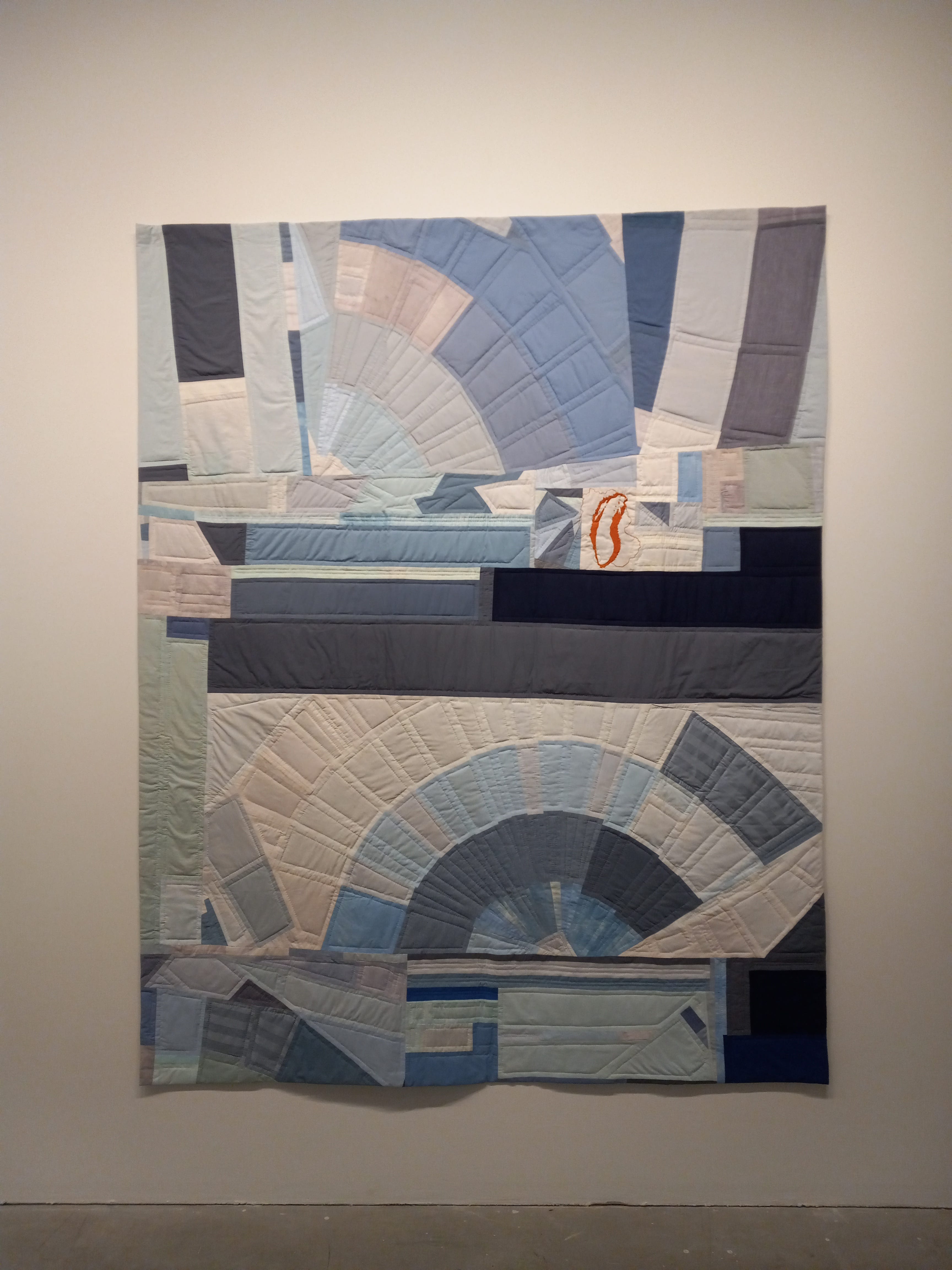
As an example, consider Karen Reimer’s quilt-with-embroidery Location of Harmful Algae Blooms in Lake Michigan. To the right of center is a detailed map of Lake Michigan with three small circles at different points of the shoreline, detailing the titular algae blooms. This passage of the work contrasts both in color and treatment with the rest of the piece’s angular shapes in shades of blue. How does the majority of the work reinforce the overall message Reimer is trying to convey? The blue-gray quilting evokes sunrises or maybe even the expanding blooms themselves; it is a pleasing arrangement of forms . . . and therein lies the problem. The tiny little Lake Michigan map, surrounded by all this beauty, reminds me of an inconvenient truth offhandedly mentioned in the course of a chatty conversation and then quickly suppressed. Perhaps Reimer is trying to make a point about how these kinds of environmental problems are often brushed aside in the public consciousness; but I felt that the result was too distracting. My mind wanted to explore the forms and shades of the blue-gray quilted passages and not their relation to the red embroidered lake map. It was as if an important truth was being told at a loud party, and I was straining to hear the truth’s speaker but everyone else was making too much noise.
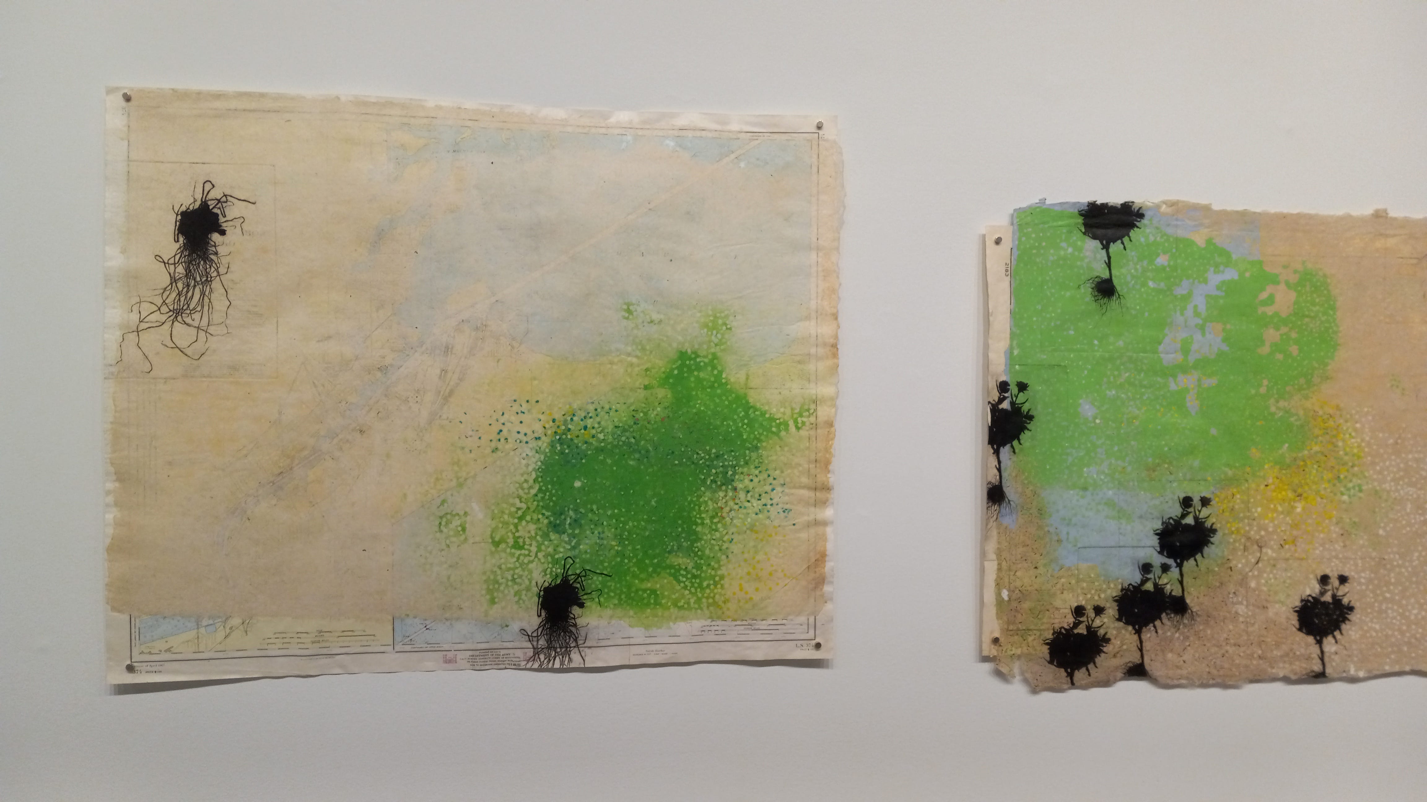
Here’s another example, focused as well on algal blooms. Timothy Frerichs had several pieces on display from his Bloom Map series. It is hard to see in the photo below but the pieces in the series are made of antique maps of Lake Erie from the mid-twentieth century, onto which Frerichs has pasted printouts of the location of harmful blooms of algae which exist on the surface of the lake. For some unaccountable reason, though, the printouts of the blooms do not correspond with the information on the maps below them; in several instances the blooms are shown spreading onto the land next to the lake (which is, of course, impossible in reality). By using the vocabulary of maps, Frerichs is invoking the idea of an objective record of real-world conditions; yet his layers of information are superimposed in an impossible scenario, which undermines that objectivity. Is he saying that the blooms on the lake have an affect on the land as well? Perhaps so; but he chose the wrong vocabulary with which to make that point.
This next piece has the quality of a graph; as fits the form, I would have expected it to graphically, immediately, and clearly explicate the point the artist is trying to make. It is 100 Year Perspective: The Hoover Dam Intake Towers, by Jess Benjamin.
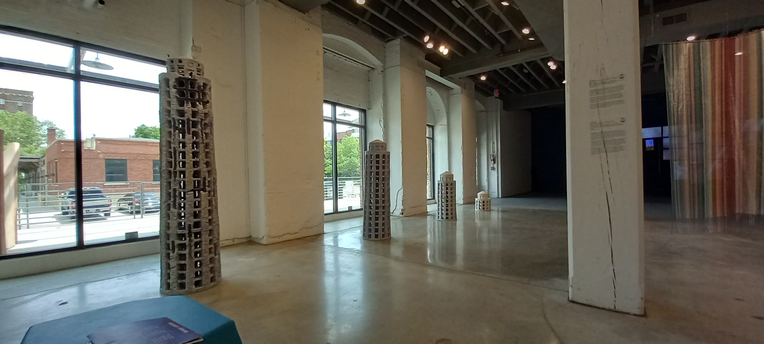
These four ceramic pillars, each one taller than the next, are meant to vividly demonstrate the effect of Lake Mead’s receding water level. However, there is a profound disconnect between what we are meant to see—the lowering water levels—and what we actually see: a growing tower. Or is the tower shrinking? There is no clear directionality present in this piece; no privileging of the right-to-left view over the left-to-right view. The towers could be read either way. And with the flat, level gallery floor standing in for the lake’s surface, the effect of receding water is obliterated. For the effect to work, shouldn’t the tops of the towers all be the same height?
These were the most prominent examples of the lack of clear communicative ability I saw in the show; but there were other pieces which seemed to have a similar, if not so egregious, lack of focus. It felt almost as if the artists, in a rush to get their work finished and ready for display, skipped the conceptualizing stage and didn’t think clearly through all of the implications of their artistic choices. One of the rooms of the gallery devoted to an assortment of photographs and video montages related to the 2015 drinking water disaster in Flint, Michigan. I certainly don’t want to downplay the severity of what happened in Flint, or to suggest that it is not worth making art about; but these photographs did not seem to be showing me what was happening. They lacked a narrative thrust; they didn’t tell me anything about what the photographer was trying to show me, other than “these things happen.” When I compare these images to one of the best propagandistic images of the early nineteenth century, Goya’s Third of May 1808—

—I’m left with the impression that Goya is much more able to tell me what to think about the event he is depicting; I do not get the same definite narrative sense when I see the Bemis photographs. This is a deficit, one which ought to be addressed; the suffering of the people of Flint deserves a more forceful and well-crafted witness from the arts than this. “This was indeed a terrible situation,” I can say about Flint, because I lived through the news coverage of the event; “why aren’t the artists telling this truth to me and to the future?” I never lived through the invasion of the Iberian peninsula in 1808, but Goya’s painting tells me what it was like; art communicates to me about the Third of May in a way that it has not yet done for Flint.
The deficit I’m talking about was not present in all of the artworks at the show. Two, in particular, stood out to me for their clear and competent messaging.
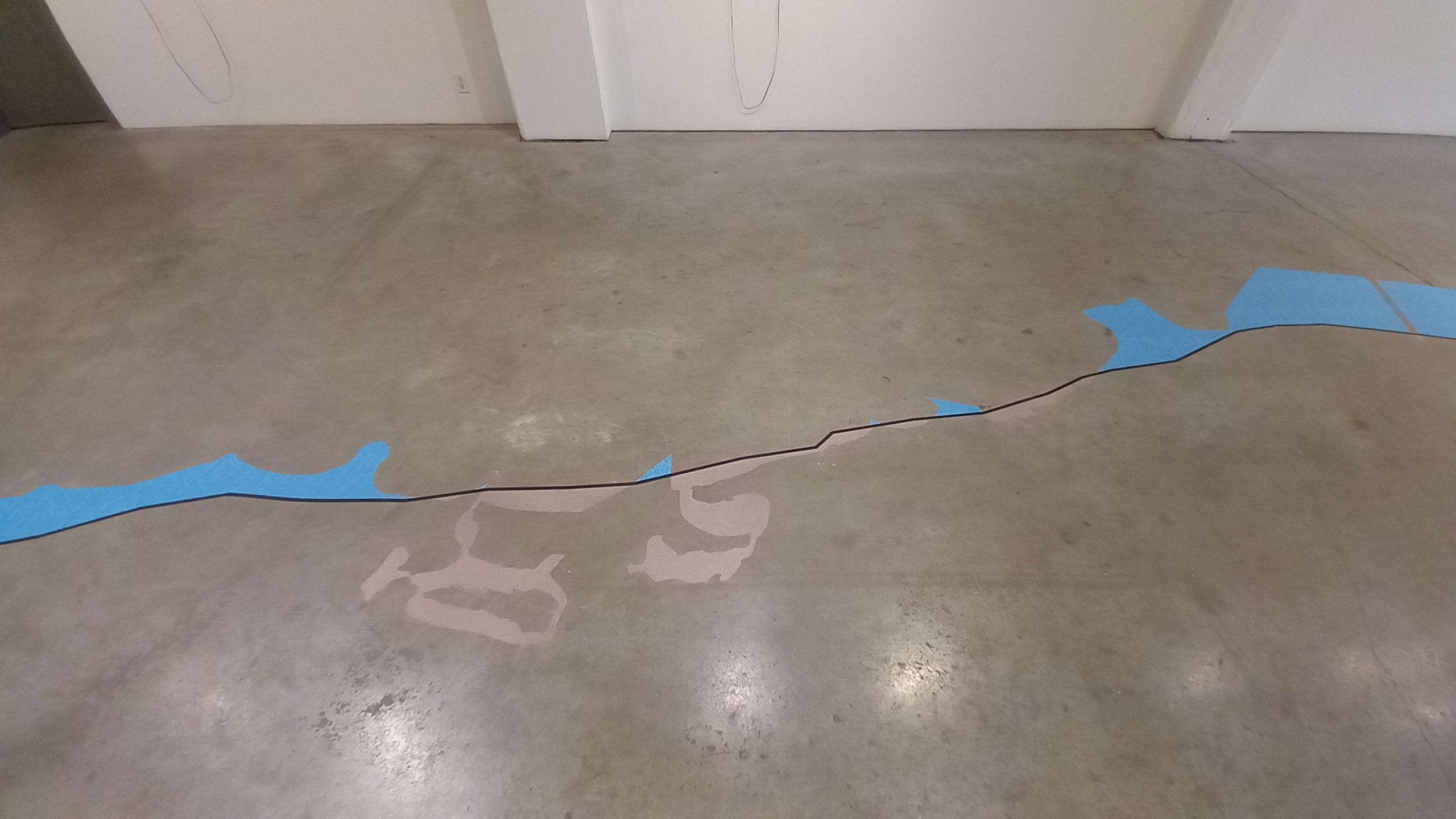
Shown above is part of JeeYeun Lee’s Shore Land. The solid black line indicates the shore of Lake Michigan as it was in 1820, before white settlers started to modify the landscape in the area. The blue decals on the floor indicate areas of the former lake which are now dry land; the brown areas, places that were formerly land but have now become part of the lake. This map doesn’t explain why these parts of the lake are now different from what they were before — some places of the shore have succumbed to erosion, and some have been deliberately turned into harbors for human use. But the map clearly signals that the original, pre-settlement, lakeshore is to be preferred over the anthropomorphed lake. The colors reinforce the “correct” state of the areas in question, as does the fact of the original shoreline being a definite, thick, solid black line— “this is how it was and how it ought to be” — and the present-day shoreline being merely the boundary between differently-colored decals and the bare floor, and therefore not a “line” at all. Whether or not you agree with this assessment of the rightness of the human modifications is beside the point; the artist’s views on the matter are quite clear.
Another work which shapes a narrative—this time much more subtly—is shown below. It is another piece by Karen Reimer, part of her Great Plains series, titled Changes in Recoverable Water in the High Plains Aquifer.
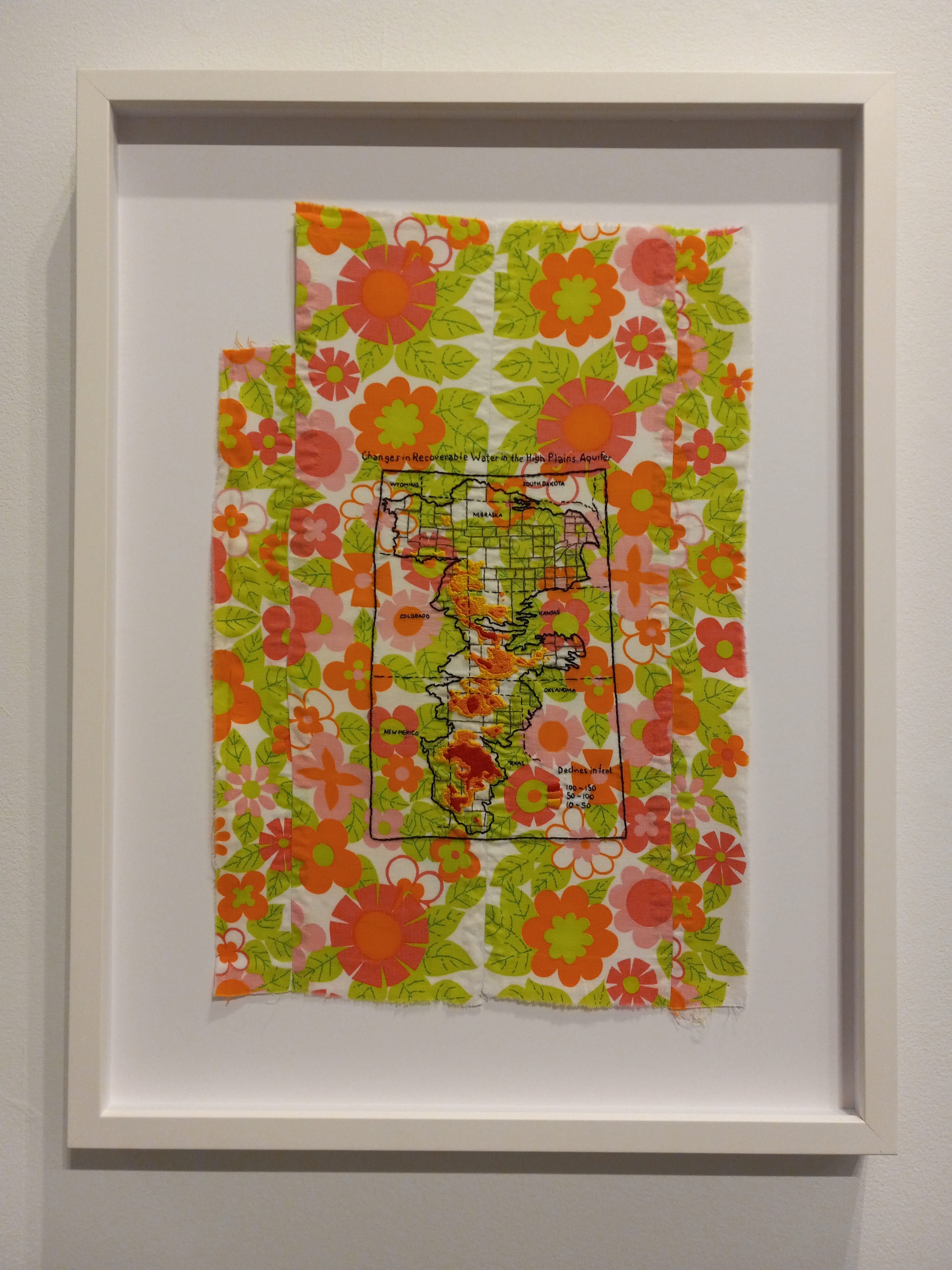
In this piece, the printed fabric ground serves as a distraction from the embroidered depiction of the Ogallala aquifer’s diminished water level. The embroidery blends into the pattern of flowers and it takes some effort to read the infographic map of the aquifer’s depletion. This is powerfully effective; Reimer is showing us how easy it is to forget about the aquifer in our daily lives. The groundwater crisis blends in to the background of our existence in the plains; life is full of distractions, and isn’t it more pleasant to look at some pretty flowers than to acknowledge what is happening with the aquifer? This is similar to how she treated the issue in her Lake Michigan piece, but now the colors and forms harmonize with each other rather than work against each other; and since the found printed fabric in Aquifer was not the product of Reimer’s hand as were the quilted blue shapes in Lake Michigan, it does not seem as though Reimer herself is trying to distract me from the point she is making.
The Bemis show’s overarching theme—the relation and interaction between humanity and the natural world—reminds me of Caspar David Friedrich’s 1824 painting An Idealized Scene of an Arctic Sea, with a Wrecked Ship on the Heaped Masses of Ice.

Friedrich’s canvas is meant to portray the power and irresistible force of nature; notice the relatively small form of the wrecked ship to the right, completely overwhelmed by the massive mound of ice in the center. It evokes the power of the natural environment, and humanity’s incompetence against forces outside the realm of his agency.
Perhaps this is not the sort of message the Bemis artists are trying to convey in From the Great Lakes to the Great Plains: in this show I sense a line of reasoning which suggests that the forces of nature are powerless to stop the onslaught of anthropogenic change. Nowhere in the exhibit was I told that the disastrous effects of environmental degradation were reversible. Perhaps, then, what is meant in this show is a lament for the destructiveness wrought on the landscape by human activity. The show could be interpreted as an elegy to a state of things which has now passed.
Am I asking too much of an elegy to tell me what to think about an issue? Perhaps I’m wrong to want a call to public action when what I’m offered is a record of private grief. Most of the pieces in the Bemis show are just that: testimonies of private griefs and worries, expressed through particularized and personal languages of symbolism which may not, in fact, be intelligible to the average gallery visitor.
Perhaps. But I would have hoped that the artists could be more clear in their expression if they presented their expression for public scrutiny. It should be possible to say of an artist crafting a lament or an elegy that their thoughts and statements are commendable, but that their execution could be more precise. There’s nothing wrong with artistic ambiguity; but what I saw was more like artistic sloppiness.
You're picking up on the problem of contemporary art today. Artivism. I like to say that art-activism leads to bad art and bad activism. But the predominant notion in art schools today is "art will save the world." Of course, they have no clue how. They think it just, kinda, magically works. You make art and the whole world slaps its forehead and corrects its ways.
I like this quote in particular: "Most of the pieces in the Bemis show are just that: testimonies of private griefs and worries, expressed through particularized and personal languages of symbolism which may not, in fact, be intelligible to the average gallery visitor."
This is exactly what artists are trained to do in grad school. It would be framed as; 1. categorize your identity group 2. identify the tenants of an ideology 3. create a personal visual language to preach these things. This means that each artist is a unique mouthpiece for a particular ideology to which they lend their intersectional identity and platform.
The artwork does not need to be compelling, it needs to be a part of the conquering. The algal blooms spreading onto the land is a better representation of how critical theory has decimated contemporary art making and turned it into contemporary propaganda galleries. They artwork is not meant to communicate, it is meant to preach to the choir. It is a planted flag, nothing more. It will be forgotten when the next ideology takes over. This is also true of artists across the entire political spectrum, btw.