

Monstrously unambiguous
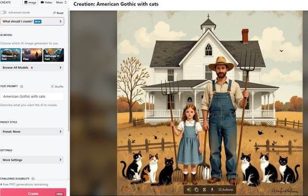
Allow me, please, to assault your eyes with ugly art made by robots. I assure you that it won’t take long, and though the aesthetic sting will hurt, the pain will dissipate as quickly as that of your annual flu shot. Remember American Gothic? Of course you do. If you want to look at it in real life it’s sitting in the Art Institute of Chicago, right across the room from Nighthawks; but you don’t need to actually go all the way over there to see it. You can see it in your mind right now because you’ve been exposed to it a bazillion times: in movies, political cartoons, advertisements, Christmas and birthday cards, and so on; it has seeped into your subconscious, staining it permanently. Guess what? It has seeped into the “consciousness” of the AI art generators as well—so much so that they have no problem conjuring up a version of it for me. Watch what happens when I tell Nightcafé to make a postmodern ironic sendup of it—say, for instance, “American Gothic with cats.”
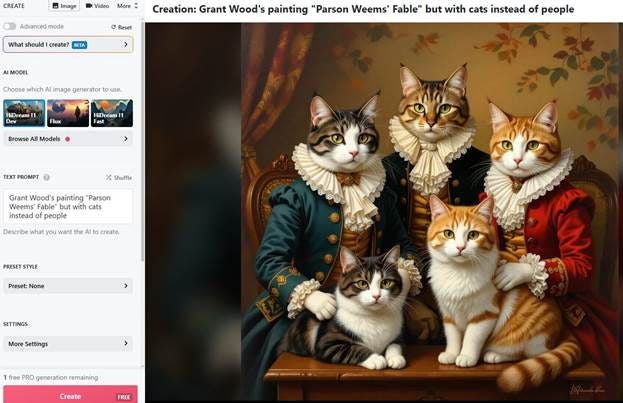
I tried the same thing with prompts based on the titles of other works by Grant Wood (Daughters of Revolution and Parson Weems’ Fable, both considerably less well-known than American Gothic) . . . and the results were less than ideal.


I was using rather bare-bones prompts in this exercise and I felt sorry for the poor AI, so I tried to be more explicit in my prompt; still, though, I was disappointed in the result.
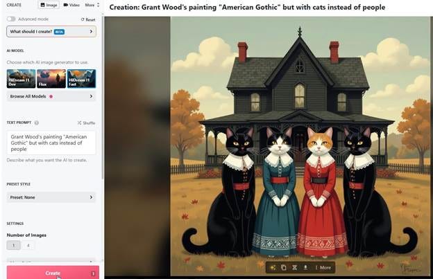
Yet the robot knew exactly what I wanted when I used a prompt referencing Grant Wood’s iconic and kitschy American Gothic. (Although if I had asked an actual human to make this image I am sure they would have gotten more of the details right: two cats instead of four, the cats would have been gendered correctly, and the house would have been white and not black).
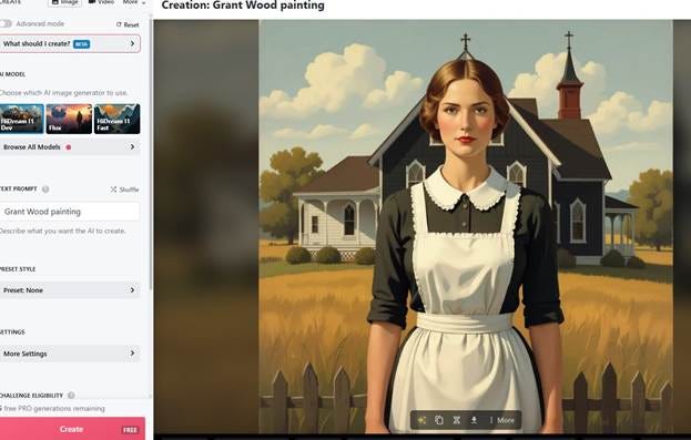
I even scaled back the specificity and told the AI to make me a “Grant Wood painting” and this is what I got. In the training data for the robot image slaves, Grant Wood has, evidently, been reduced to a caricature of himself: his entire career, complex as it was, is reduced to only a few things—farmhouse with gothic window, farm person standing outside facing the viewer.
But American Gothic is a much more complicated painting than the AI art generators realize. To start, the expressions on the faces of the two models in Grant Wood’s original work are difficult to read—unlike the expression of the confident and self-assured woman the AI gave me in the image above. There is a note of tiredness in Wood’s farmer; a good deal of concern and uncertainty in his daughter. Or maybe they are preacher and daughter? The black jacket on Wood’s male model is interpreted by some art historians as a hint that the pitchfork-wielding old man is a country parson. What is that pitchfork supposed to mean, anyway? Are these people malevolent, brandishing their weaponry as they prevent us from coming near their house? Is it significant that the woman has a single lock of hair dangling down her neck? Why is the pitchfork’s shape reflected in the seams of the man’s overalls? Why are the curtains drawn shut in their house?1
There is no evidence Grant Wood was deliberately trying to mock or satirize the subjects of his image. In fact, he repeatedly made public declarations to the contrary. I am not convinced that Wood genuinely loved the people and landscape of Iowa, despite his settling there and even trying to spearhead an emerging regionalist art movement headquartered in Cedar Rapids; I think he wanted to love them, but an important part of his psyche still held them at a distance. All throughout his last decade, after painting American Gothic and thereby becoming instantly famous, he kept making images of the small-town people he encountered which have this slightly sour note to them, as if Wood were laughing at them in a not-fully-sympathetic way.
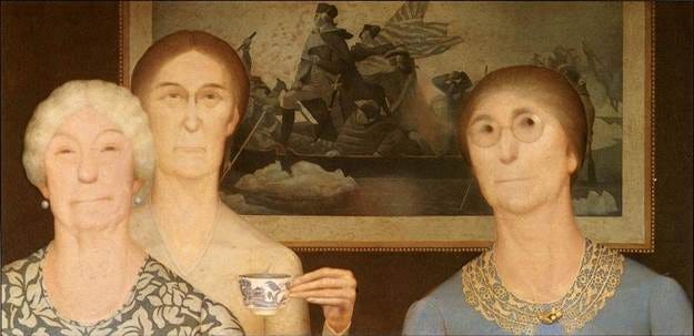
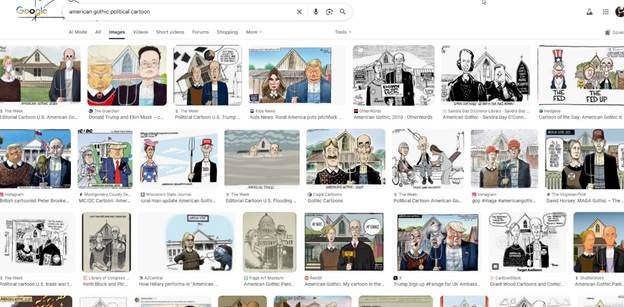
American Gothic, on the other hand, is ambiguous. Whatever satire it may or may not communicate can’t really be determined with certainty. Part of the reason it has become so famous is because it is undeniably more than just a portrait of a few Iowa people and a funny-looking house; but no one can be sure what that “more than” actually is, so they add their own “more than” and the picture becomes about anything. Parodies abound, as we’ve already mentioned. Wanda Corn, in her exhibition catalog Grant Wood: The Regionalist Vision, devotes her last chapter to her collection of American Gothic parodies, ripoffs, sendups, and appropriations, all of which depend on American Gothic’s being understood as a painting of basic, average, normal American people. Since she wrote her book in 1983 the situation has not changed. American Gothic is a foundation on which any spoof or satire can be successfully erected.
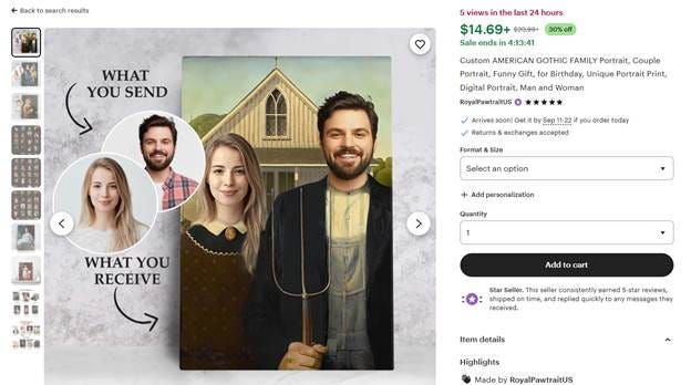
It is possible to get custom versions of American Gothic with different people’s faces in place of the farmer and his daughter from the original painting. You can go to sites with names like PopArtYou or MyDaVinci, upload your own photos, and have yourself in the painting. You can get a version of American Gothic with aliens, or better yet, with the two main characters from Stranger Things. You can get the picture with genders reversed. And on and on. Whatever satirical message may have been present in American Gothic when it was first exhibited has been blunted in the present day. It has entered the realm of symbols and now it’s extremely hard for the majority of people to take it on whatever terms Grant Wood meant for it.
American Gothic was not created for the purpose of becoming a symbol in this manner. None of the excessively reproduced and thus kitschified works of highbrow art — Mona Lisa, The Scream, Starry Night, The Swing — ever were. But somehow it happened: they have become caked with such a thick crust of appropriation that I doubt it is possible to seriously discuss them anymore from an aesthetic point of view. It’s a strange inversion of James Elkins’ concept of monstrously ambiguous2 paintings: these paintings have become monstrously unambiguous. They have become resistant to any nuanced interpretation and have been thrown to the world of commerce to be torn up, like meat to wolves, and made into “Funny gift for birthday, Unique portrait print, Digital portrait.”
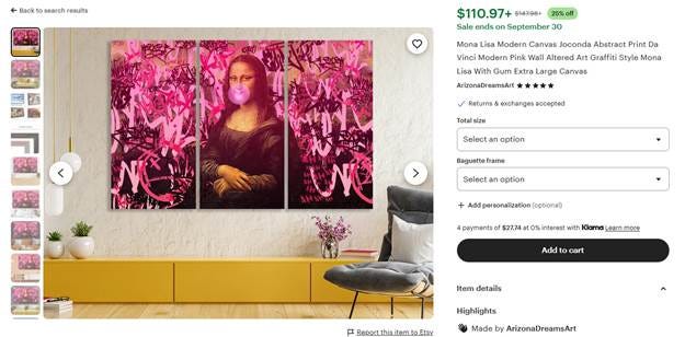
When Leonardo da Vinci spent some time in the autumn of 1503 painting a portrait of Lisa del Giocondo, it was highly unlikely he was hoping the result would be his painting’s becoming a universally understood symbol for western highbrow culture. I doubt the concept of “highbrow” even existed back in those times; if there were, though, I don’t think it crossed Leonardo’s mind that his image would assume the role of ambassador for such a broad swath of human effort. He simply painted it and then went on with whatever other projects he was working on at the time—pictures of battles, designs for contraptions like tanks and helicopters. There simply wasn’t a need, in the early renaissance, for the kind of symbolic picture Mona Lisa has become.
Today we live in a vastly more symbolic age than Leonardo did. Meaning is constantly mediated through images. Thumbnails, avatars, icons: they’re all around us. Corporate logos, instantly identifiable, promise us a repeatable consumer experience. Colors on sports paraphernalia, worn at the game, signify our allegiance to one combatant or another. Our choice of clothes signals the way we engage with the beliefs and philosophies of the rest of the world. The most private facts about our sexuality and gender identity can be broadcast to anyone who drives past our house via any of a wide variety of pride flags flown from the porch. There are symbols everywhere, conveying propositional content, emotions, vibes, and any other sorts of meaning you can think of.
For its first three hundred or so years of existence, you would have to actually travel to the physical location of Mona Lisa and be in its presence if you wanted to see it. When the market for art reproductions opened up in the nineteenth century you could buy a print of Mona Lisa, but even then you would hang it on your wall with a sense of reverence. Yet even here we can see Mona Lisa beginning to assume its role as symbol; hung up on the wall, divorced from its original context, it becomes a stand-in for an entire attitude towards the arts. Meanwhile its own power of aesthetic communication is thereby diminished; no one, looking at a Mona Lisa print on the wall, is likely to meditate on its composition or sense of space—and in a line engraving they most certainly won’t be thinking about its use of color: thus Leonardo’s display of artistry is diminished.
As paintings lose their ability to sustain ambiguity, they become kitsch. By this I mean that the symbolic content supersedes in value any aesthetic content the image might have: no one who uses, for instance, American Gothic to convey ideas about the average American person cares at all about the aesthetic value of Grant Wood’s painting—they are using it for its symbolic value alone. The artistry is irrelevant. That is why American Gothic works as a black-and-white line drawing or a cartoony caricature, and why the people in it can be swapped for famous celebrities or animals, without the image losing its symbolic power. This is not the same with an image that is symbolic but not kitschy—Grant Wood’s other portraits, for instance Woman with Plants from one year prior to American Gothic: there’s nothing preventing this painting from becoming a symbol of old age, matronly care of the environment / farmstead, or any number of other things . . . except that it hasn’t yet. And therefore it hasn’t become kitschified.
In fact there is an inverse relationship between a painting’s ambiguity and its kitschiness. Some of the kitschiest paintings—Mona Lisa, Rosie the Riveter, the “I want you for U. S. Army” poster—live in this strange sort of world where the point of the picture is so obvious that it short-circuits our ability to think about the picture as an object of aesthetic contemplation; we are instead shuffled off to the next stage of appreciation—the apprehension of emotion—without having done any of the work of puzzling about the meaning. Is something missing in our understanding of the image? Have we skipped a step? Are we cheating?
Not really. There’s no reason why easel paintings must be approached primarily as communicators of aesthetic value. Why aren’t corporate logos, fashion designs, road signs, or advertising imagery scrutinized to the same aesthetic standards as Leonardo’s paintings? Surely Leonardo was trying for more when he made art than was the poor intern told to make the next viral ad campaign, but Leonardo is called kitschy when he’s plastered over subway cars and coffee mugs, and the ad campaign isn’t.
And to be honest, I don’t like it. It’s almost as if the logos, memes, and pride flags are being penalized for communicating clearly, distinctly, and unambiguously. The old highbrow way of thinking about pictures simply can’t handle this kind of easily apprehended meaning. It’s just not possible to sustain an extended aesthetic / critical commentary on, for instance, the Thin Blue Line flag or the Pepsi logo.3 I have a sneaky feeling, though, that there isn’t much difference between the monstrous unambiguity of Mona Lisa or American Gothic, which renders nuanced discussion difficult, and the Elkins-style monstrous ambiguity (leading to a lack of settled understanding) of a complicated painting like The Tempest. In both instances the enjoyable process of gradually coming to a settled understanding is broken down: one, because the meaning has become too obvious—the other, because the meaning has become too obscure. By the way—you had to go look up Giorgione’s The Tempest, didn’t you. You don’t have it in your mind’s eye. Go read a few books about it—you still won’t know what it means. No one knows what it means. But you know exactly what the Coca-Cola logo means. Or the Burger King logo. Yes, even you art historians know what those images mean.
Obviously these questions are the kind which can, in fact, be asked of Grant Wood’s painting and not of the AI imagery I shared, since they touch upon conscious decisions which Wood made in the process of creating his artwork; yet the AI image generator deployed no conscious decision-making process in its image creation. All it did was guess what it thought I might want to see.
Discussed in his book Why are our Pictures Puzzles?: On the Modern Origins of Pictorial Complexity. Elkins likens “monstrously ambiguous” paintings to boils on the corpus of art history that continually get reopened and can thus never heal. Would a monstrously unambiguous painting be like a cancerous tumor—useless by itself but sapping resources which the art world could use elsewhere?
This is, of course, a challenge and a call for papers. If any of my readers want to prove me wrong by writing an essay of aesthetic criticism directed to any of the various symbols that make up our image-saturated world, the RUINS office is open for pitches. In fact, I can’t promise that RUINS itself isn’t moving away from its traditionally “highbrow” focus and embracing a new era of sustained attention to visual popular culture.
This essay made me carefully consider an aspect of art I had never really thought about before: the impossibility of my being able to see kitschified art in the same way as I would have without that pop cultural baggage. Bravo and thank you.
Well done, and it's nice to see real attention paid to the products of AI. In art history, AI is mainly studied as a social phenomenon tied to visual literacy (and, of course, as a problem in pedagogy). But the images themselves are so far going largely unstudied, perhaps because they seem monstrously kitschy and therefore unrewarding. The closest I know, from the pre-AI period, is Alexis L. Boylan, ed. Thomas Kinkade: The Artist in the Mall, and (if I'm remembering correctly) none of the essays in that book engage in close looking, iconography, style, or other sorts of traditional analyses that would be applied to objects of art historical interest.