

The contemporaneity fandom
I don’t know what to think of the current summer show I saw at Modern Arts Midtown a few weeks ago. Last time I was there the exhibition gave me a strong feeling of appropriateness to the urban muscle being currently flexed by the city of Omaha. Lots of busy patterns, lots of paintings which were full of amassed details; a sense of rushing, powerful energy was present, and everything felt like it had a definitely optimistic tone. The works in that show were more painterly and also more abstract; I said at the time that they were eminently appropriate for their place as the new art of Omaha. The current show isn’t commenting on or relating to a specific geographic locality; but it does inhabit a particular time, viz., the present contemporary moment. And though most of the works this time were oil-and-acrylic on canvas, the handling of the medium was much more in line with what is to be expected in commercial line drawings or cartoons. Even the paintings looked, for the most part, like drawings.
Another difference: the mood was not exactly optimistic but it wasn’t pessimistic either; if anything, it was full of a rather wry humor, a sort of weary yet not defeated mood similar to how blue-collar people sigh and say “it is what it is” when faced with any of the numerous maddening difficulties and frictions of modern life. But the biggest difference between the two shows was that this time it seemed the art was drawing on a more populist tradition for its vocabulary and iconography. This show contained very little reference to the depth of art history, especially the history of what counts as “fine art”; more than anything, I was reminded of the lowbrow art of the last fifty years—comic books, video games, graphic novels, graffiti. Lurking within the show there was also a subtle “commercial” or even “capitalist” strain (one which I’m not sure the artists would have approved of had they noted it—capitalism is rather out of fashion these days). Many of these artworks reminded me of T-shirt designs, the “edgy” or “attitude” ones found at Hot Topic—and there were a number of “collectible” sculptures for sale (which I will discuss further in a moment).
But as I said, I’m not sure what to think of the show, because . . . I don’t know, it felt like the art was not connected in any way to the long tradition of The Beautiful which has been the focus, more or less, of almost all the art in the Western tradition for the past two and a half millennia or so. Since the Greeks, artists have been trying to capture some sort of sense of the ideal beautiful, to varying degrees of success. And these ideals of beauty were, for better or worse, founded on things the Greeks thought were beautiful: the human form, mostly, but also pastoralism of various types and kinds.
These sources of imagery served artists well enough until perhaps the beginning of the twentieth century. I really don’t have the space or inclination, here, to discuss what happened to art circa 1900 or so, but you can read the full account in the beginning of Robert Hughes’ The Shock of the New and the end of Kenneth Clark’s Landscape into Art. Hughes discusses how the technological advances of the late nineteenth century gave artists a new vocabulary of images with which to make their art. Clark’s book describes how, when artists turned to the beauty of the machine, they of necessity turned away from the natural world. But this was not a coincidence. Clark argues that as a consequence of the Darwinian worldview the natural world was no longer seen as a place of peace and refuge; it was a hostile, fierce, ferocious place. Tennyson wrote of “Nature red in tooth and claw”; no happy garden of peace anymore, nature was! And the artists decided not to look to nature anymore for their ideal of beauty. In the aftermath it seems beauty as a whole has been more or less set aside; these days it is extremely rare for an artist to trade in beauty at all—or, at least, in the idealized beauty which fascinated the Greeks. Along with a fascination with machines and surfaces, the art of the last five quarter-centuries is interested in particulars instead of ideals.
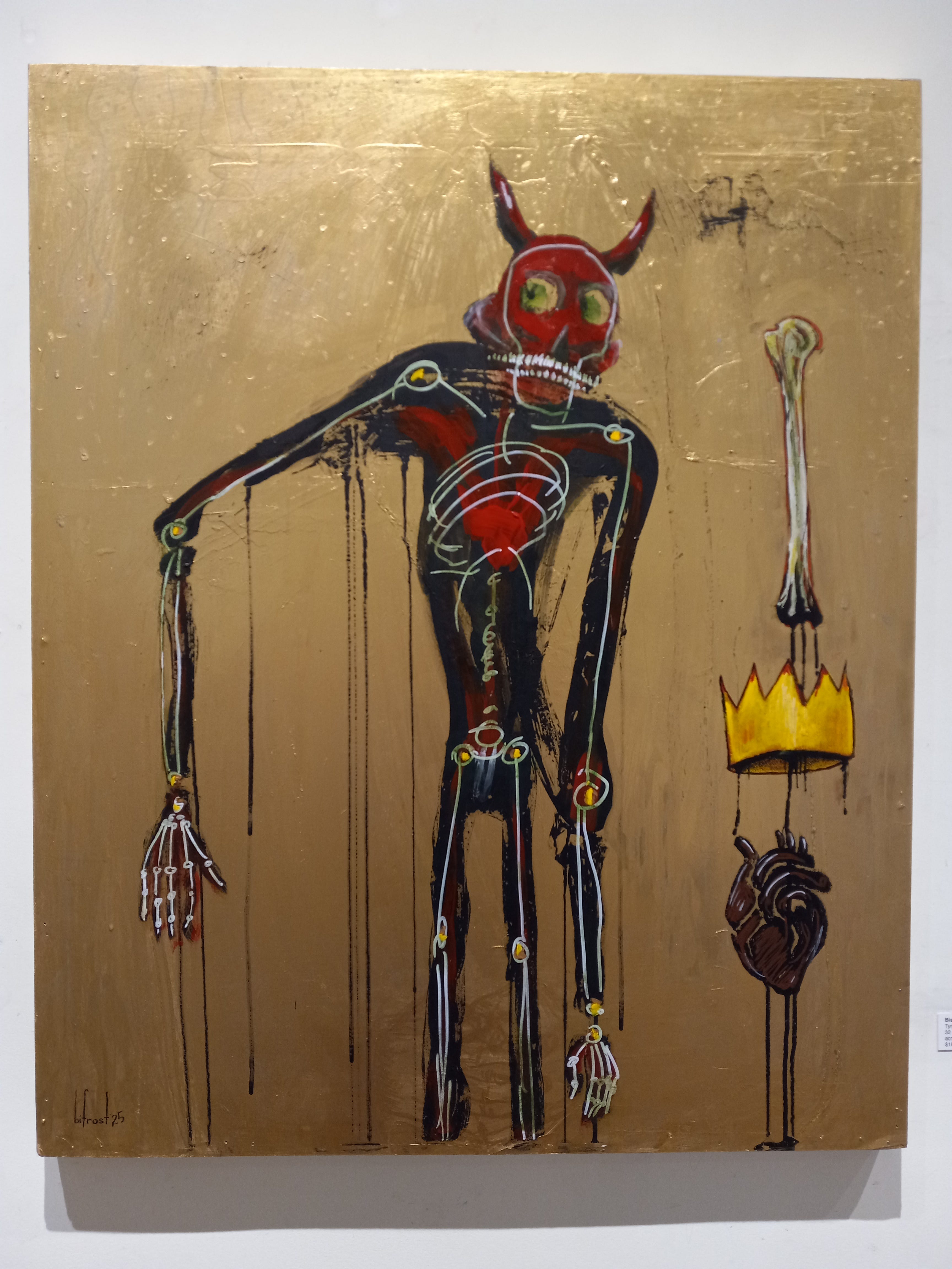
Alright, that’s enough theory, let’s go look at some art. Modern Arts Midtown was showing quite a large number of what I like to call fake Basquiats: mannerist paintings of various scribbly figures and scenes in the style made famous by Jean-Michel Basquiat in the eighties. Probably the best was this one by Bishop Frost. The imagery is memorable, if not readily interpretable, and the gold paint lends a nice touch: it reminds me of how the painters of the medieval period were fond of putting gold leaf on things, especially depictions of heaven. Does this picture seek to reference that? It’s hard to say; these days, gold might simply refer to wealth, bling, filthy lucre, and all that sort of thing.
Mykl Welch, whose works I’ve seen before and greatly admire, produced the strongest works in the show. Here are a few. I was especially fond of the painting of the bottle opener. However, I was confused by the background. It seemed to only exist because the space needed to be filled. What’s wrong, these days, with an empty background such as is found in many still life paintings, from the masterworks of Cotán to Dalí’s Basket of Bread to Wayne Thiebaud’s cakes and pies? I’ll give Welch the benefit of the doubt, though, since this kind of treatment of the background is common in his paintings and it’s always interesting to look at.


Jamie Burmeister’s painting-sculptures provided an element of humor, but I thought the humor was a little sour. I get it: abstract expressionist paintings of lines (such as those produced by Morris Louis or Barnett Newman) are a little bland, but if we’re just going to giggle at them we won’t be able to understand what their makers were trying to say. Burmeister’s pictures felt too ironically detached from the source of their imagery. (I did manage to get some cool photos of his little models at their job of paintings spots in a wall. If you use your imagination they look like actual full-size painters who were cursed by some witch and turned to bronze.)


Fredy Rincon made several pictures of people wearing animal masks and looking tough. Here are some representative examples, as well as a picture of a snake which I rather liked; there’s quite a lot of depth in the symbolism in this one and I found myself taking much more time looking at it than I did any of Rincon’s other works. Rincon’s works epitomize what I was saying earlier about the source of the imagery in these pictures being derived from sources outside the Greek ideal of beauty. Everything was edgy, gritty, broken, beat-up, worn-out, and had some sort of attitude.


In the farthest back room of the gallery was a surprise: several sculptures—or should I say “collectible figures”—by the likes of KAWS, Superplastic, Murakami, and other artists of similar stripe. I honestly have no idea at all why these sculptures were in this show. None of the people who made them are Omaha artists. Were they on consignment or something like that? Also, why are the sculptures by KAWS and Coarse so similar to each other? At least there might be some sort of narrative element to them—their figures are at least doing something. But the sculpture by Superplastic is just sitting there, doing nothing at all except existing. Maybe it is the descendant of Lipchitz’s “smokers’ articles.” Also . . . there’s some of that gold again.


So, what to make of all this art? Is it any good? What’s it about?
Frater Asemlen recently wrote a manifesto detailing the relationship between pop art, “art-pop,” and fan art. It includes some useful points and definitions which are particularly applicable to what is going on at Modern Arts Midtown. Towards the beginning of the manifesto Asemlen divides pop art into two great sub-movements—corporate art and indie art—which are surprisingly similar despite the latter nearly always being positioned as antagonistic to the former. I don’t know if the artists at Modern Arts Midtown would consider their work “indie” or not; but the pieces I saw would definitely match some of the principles that Asemlen lists as the defining features of pop art today. The statues by Murakami et al. are most certainly part of corporate pop art. These artists’ wikipedia pages are mostly long lists of tie-ins with hip hop producers, tech companies, sports figures, “top brands,” and other corporate entities. Asemlen then pivots his essay into a manifesto for the renewed acceptance of fan art as a legitimate endeavor for artists. Much of what I saw at MAM falls somewhere in between pop art and fan art; its pop elements would be its witty, gimmicky, glamorous aspects, but its fan-art connotations are a little harder to define. If the MAM artists are “fans” of anything, it would be the aforementioned contemporary imagery (video games, animation, etc.) and it would correlate very neatly with what is undoubtedly the most widespread and noticeable fan community of all time: that of the fans of Greek and Roman art. The history of western art, from about the time of Botticelli and Mantegna until that of Gêrome and Bouguereau, and with important exceptions, was an emulation of the model of antiquity: the pursuit of idealized beauty which I mentioned earlier. If my hunch is right, what I saw at MAM were the creations of artists who aren’t part of the antiquity fandom; perhaps it could be said that they are members of the contemporaneity fandom? There’s got to be a better word for the focus on imperfect, unidealized, particularized imagery, drawn from popular sources of the last few decades, that I’m seeing here at this art show.
Or maybe what’s happening is these artists are changing the focus of their attentions from the set of beautiful objects in general to the set of cool objects. A few years ago Étienne Fortier-Dubois published an elaborate Venn diagram as part of an attempt at a taxonomy of beauty. In the middle of his Venn diagram is a circle labelled “elegant” and one labelled “sexy / hot”; the overlap of those two circles, I’d argue, is the focus of attention for most of the art of the antiquities fandom—the art with people in it, that is. The art not peopled by people—the perspective work of the Renaissance, the still lifes, the landscapes—would fall somewhere else within the big circle labelled “beautiful.” Today, at Modern Arts Midtown, what we’re seeing is art made by people who are focused on the oval Étienne labels “cool”—and, perhaps, depending on whether or not you actually enjoy this kind of art, the part of the oval which is flopping out of the “beautiful” circle, lying only within the “interesting.”
I don’t want to make any value judgements on the worth of the art at MAM; like I said more than once, I don’t know what to think of it. It’s undeniable, though, that the past fifty years have given artists an enormous amount of new visual stimuli, new imagery, as potent as that mentioned by Robert Hughes as inciting an art of the machine in the early decades of the twentieth century; and that it is a commendable thing for these artists to work towards making sense of that imagery.
Yeah.
Though I can appreciate and even like some aspects of the Bishop and Welch sort of paintings, all that you show here is the current mode of Pop Art galleries in Midtown Manhattan that basically take the Warhol -> Banksy image as replication of itself tract and add street fashion branding. I would imagine the distinction between the Omaha show and the Manhattan commercial galleries are scale and price. Those pieces in Midtown are fuckong gigantic, and it's hard to imagine them used for much other than a hip-hop music video (not necessarily derogatory) or Knicks player's living room (derogatory).
But they're there because they sell, I guess.
Hate us a strong word but I actively dislike the plastic figurine stuff you showed last. I saw that exact same type of stuff by those exact makers in a modern art museum in Amsterdam that was way overpriced — like 40 euro to get in and get right across the street was the Van Gogh and National galleries that were three times as large, much more full of art, and the set was simply better. Hate us a strong word but I don't "get" anything from the art other than, "Yeah cool." The figures have attitude, I guess, but having visited goth galleries with doom cookie and spoopy figurines over the years, at least I get the attitude from those. This is more like basic bitch? I dunno. Normies who decided they're "edgy." I don't even think the gloomcookie stuff is good, I just get it.
My wife sometimes is exasperated at my openness and willingness to call art art even when it's not good or super commercial or lazy or sloppy or whatever, so she might not consider this stuff art at all. I do but it's empty art, for sure. Containers, art-shaped pieces for the continuation of the modern art market and it's infrastructure. Can't blame those design studio type people from extruding goofy non-articulating toys for rich people, it's a living.